Color Swirl Style
This style allows you to turn a bulleted list (UL) into a swiriling image where the border will move on mouseover or tab activation. It also allows you to place text into the space when activated it will appear over the image. You are free to use this on your pages but remember if the text in an image is important it needs to be presented to the end user in plain text.
About this style
To help edit and maintain ease of update the bulleted list is broken down into three items within a standard bulleted list.
- Item one is left blank, it will become the border
- item two is a standard image with alt text
- item three is a single hyperlink for activation
You are free to use any number of lits within an editing section but each list will be styled the same way. If you need to have lists and swirls on the same page put them in different sections.
Best Practices:
Images for each swirl are up to you and square images work best. By default images are scaled down to 200px by 200px but will expand to a maxium of 350px by 350px depending on which css style you use.
Below you'll find two examples where the image is not square and you can see more distortion the smaller the image is.
CSS Style
list_colorswirl

CSS Style
list_colorswirl_350
-
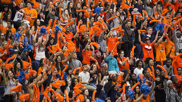
- Fullerton Titans