Tab Navigation
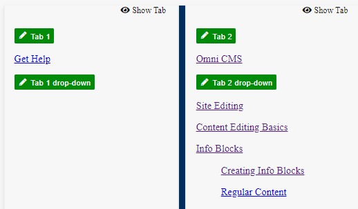
Each site has one main navigation bar that can have its own dropdown list of links. This is called extened navigation. Each extended navigation can links with one level of nested links that will appear with an accordion style open/close feature.
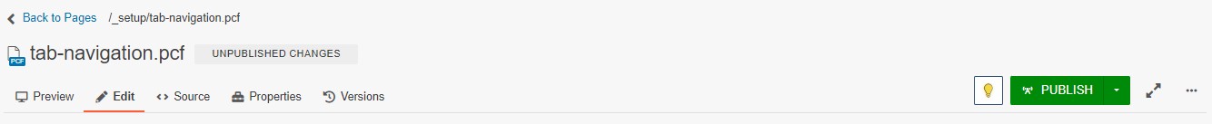
NOTE: The light bulb icon is on in the image above. That means that the page has been checked out. A page must be checked out in order to access the properties tab or edit tab content.

Creating Nested Extended Navigation
If you want to create a sub group on any link within the extended navigation its easy to do. Nesting requires that you have a primary link first.
 To create sub links use the indent feature in the editing toolbar. There is only one level of nesting allowed so do not use the indent feature to try and make multiple levels of nested links.
In the editor you will only see the indented links but when it is published and rendered on the public facing page it will automatically nest all indented items with their parent link.
Close
Campus Resources
Academics
Academics Overview
Degrees and Majors
Continuing Education
Pollak Library
Academic Advisement
Course Catalog
Admissions & Aid
Office of Admissions
Prospective Students Degrees and Majors
Tuition
Financial Aid
For First-Time Freshman
For Transfer Students
For Graduate Students
For International Students
Outreach and Recruitment
Campus Tours
Student Life
Division of Student Affairs
Housing and Residential Engagement
Financial Resources
Academic Resources
Student Services
Health and Wellness
Join a Club
Campus Dining
Career Center
About CSUF
CSUF Overview
Rankings
Human Resources and Inclusive Excellence
Engagement and Belonging
CSUF News
Campus Calendar
Colleges
College of the Arts
College of Business and Economics
College of Communications
College of Education
Engineering & Computer Science
College of Health and Human Development
College of Humanities and Social Sciences
College of Natural Sciences & Mathematics
Divisions
Office of the President
Office of the Provost and Vice President for Academic Affairs
Division of Administration and Finance
Human Resources and Inclusive Excellence
Division of Information Technology
Division of Student Affairs
University Advancement
Emergency & Wellness
Campus Police
Emergency Information
Student Health Center
Student Wellness / Counseling Services
Title IX Reporting
Services & Supplies
Academic Advisement
Titan One-Stop Shop
Associated Students, Inc.
Disability Support Services
Student Software
Faculty & Staff Software
Web Email
Getting Here
Campus Map and Direction
Parking
Visitor Information
Quicklinks
A through - Z index
Campus Calendar
CSUF News
Career
Bookstore
Information For:
Alumni
Parents and Families
Journalist
Close