This page uses javascript to help render elements, if you have problems please enable javascript.
 
You are now inside the main content area
 
left col

Dynamic Info Blocks

Applications

Add multiple data points to any page, use categories and tags to help filter, and you have an application.  These simple items will help add rich content to your site without needing to maintain more pages.  They can also be prefiltered so you just see content that matches a page's without a big interface around it.

right col
 
left col

About Applications

This page will run through the way applications are created, setup options, and data entry.  Below you will learn the various fields that are available as well as way to go beyond the default labels to craft something that is best suited to the needs of a particular use case.

Application Styles & Formatting

To learn more about transforming an exisiting application into another format, layout, or modifiers check out our styles guide for applications.  It has the style classes and modifiers for use on the pages that use them.

right col
 
 
left col

[video text goes here]

[video file goes here]

right col
 
 
left col

Info Block Type: Dynamic Content

To start you'll need to set the info block type to dynamic.  If the info block wasn't set as dynamic it can be changed in the page properties.  

In the custom settings you can set the Used As drop-down to Dynamic Content.

Depending on your needs you can also choose to increase the amount of content blocks that you have available in the edit mode.

When you're ready save the settings and return to the edit screen.


page properties options to set info block as dynamic

right col
 
 
left col

Interface Setup

Once the content type is set to dynamic you can go ahead and set the dynamic type.  This will help change the editing screen so you get the best experience for your block type.


dynamic content with two buttons for interface setup and snapshots
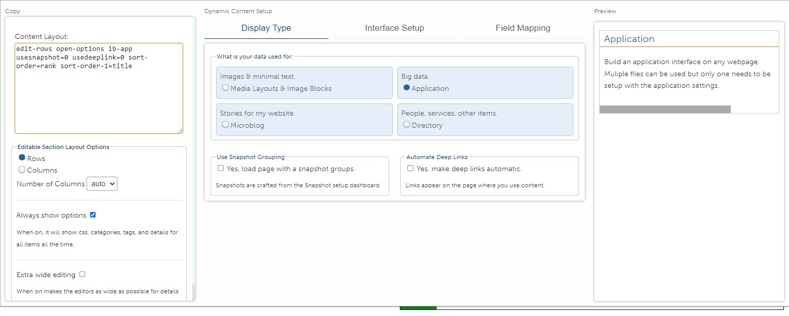
In the left menu will be two buttons next to the content layout editor.  The top button is used for the presentation and below that is the button for snapshots.

To edit your info block interface setup use the presentation button.  This will open the interface overlay panel where you can make further choices.
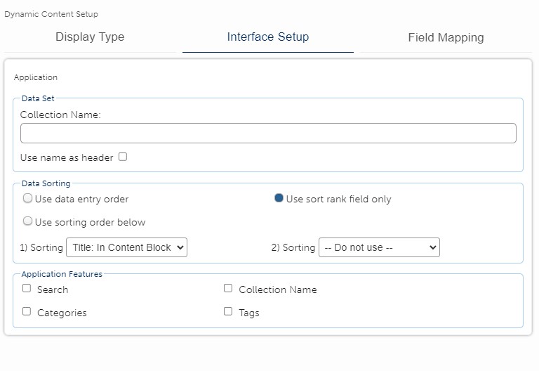
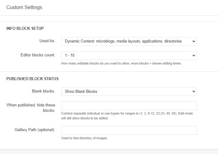
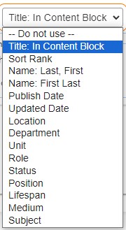
 

right col
 
 
left col

Dynamic Content Interface Options

The interface options will overlay the info block editing area, don't worry you can always press the presentation button to remove it. 

The interface is split up into three major areas: the copy, the content setup, and the preview panels.  When using application info blocks the preview panel will not be used.

overlay panel with three columns and options for setting up dynamic content types

right col
 
left col
right col
 
 
left col

The Copy Panel and Editor Options

The first option in the copy panel is Content Layout.  As you work through your setup it will update the Content Layout textarea.  This code is auto generated and used to help structure the info block interface when put on content pages. 

Editable Section Layout Options

Below the content layout is are the controls for Editable Section Layout Options.  The first option would allow you to change the way each info block is set.  Leave it as rows with number of columns set to auto.

The always show options check box will allow you to have the css, categories, tags, and details editor boxes show up.  For directories you do not need to check this box, the interface will know to always show those editors.

Extra wide editing is the next check box and can help if your directory is being used for something like a faculty / staff directory.  If you need to write significant content inside the block's content editor then it may be helpful to have the maximum space to mange that data.

Dynamic content overlay interface, copy panel with text area for content layout, options for editor display, check boxes for always show options and extra wide editing

right col
 
 
left col

Display Type

Make sure that the option for Application is marked.

There are two additional options for the dynamic content regardless of your data type.

Snapshot Grouping is used when you have multiple files that are going to be pulled into the page where you use it.  You can choose to use them or not by checking the box.

Automate Deep links provides an optional button that will allow users to deep link to the page where the content is used and preselect the info block content they want.  This is an easy way to cross link from any page directly into a specific item without needing the user to perform any other selection.  It also opens up the ability to reuse your info block content across more pages.

display type with option set to application

right col
 
 
left col

Interface Setup

Applications have a simplified interface, they are meant for general content that fits into a wide range of subjects.  Application style options will help to configure the end user interface; however, they can not add filter items or reset sorting choices.  


The Collection Name is useful when combining multiple files into a single page section.  The check box for use name as header will keep collections separated and under the header provided in the Collection Name field.  Collection name is optional.


Data sorting options help you organzie your data for display, it does not change the order in which data is entered within the info block by content editors.

Data entry order will follow the same order in which the editor displays it.  Sort rank field is a value you can enter in the Details section.  This is best used as a 1 to N number value with 1 being first.

There are two other sorting methods which you can choose from, which will allow for a two teir approach which the second one is optional.

If you decide to use the sorting by field option there are a few places where that data comes from.

  • Title - this is from the main content block, it is set using either Content Main Title or Accordion, Tab Content, Title style
  • Sort Rank - this is a found in the Details section and requires you to give it a value, best practice is to use a number
  • Name (Last, First or First, Last) - the Details section has separate styles for both first and last name
  • Published Date and Updated Dates are automatically assigned when content is created / updated.  You can overwrite the Published Date within the Details section
  • The other fields below are all found within the Details section.  If field mapping is used this will not impact the sorting, but the feilds are all considered text and will sort A-Z
    • Location, Department, Unit, Role, Status, Position, Lifespan, Medium, and Subject

Application Features allows you to control which options are available to the public interface.  While you do not have to choose any of them, if you want to turn them all on it will give you options for creating the following filters:

  • Search - creates a simple search bar across the top of the application interface
  • Collection Name - when using multiple files this will create a list of collection names based on the one from each file
  • Categories - creates a list of categories based on the fields in the info block records
  • Tags - creates a list of tags based on the fields in the info block records

The filters will have checkboxes for each item they correspond to.  Users can check off any option and it will limit the data to show matching items.  When using multiple files it will group options from all files to show to the user.  

Options will be de-duplicated and sorted A-Z, or if you use filter options you can order them based on a specific need.  Check out the application style guides for more information.

application interface setup with collection name and initial layout options

Sorting Options
List of sorting options, see content within page for more details

right col
 
 
left col
right col
 
left col

Field Mapping

The last option within the Dynamic Content Setup is the field mapping options.  If you'd like to learn more about it we have a field mapping guide that will explain the process in greater detail.

Save the interface setup

As you make different choices during the setup process that the Content Layout code within this textarea has updated. 

  • When you finish with the dynamic content setup, copy the C ontent Layout textarea code.  
  • On the left side of the editing screen click the standard editing button for Content Layout. 
  • Paste in the value you copied and save your work. 

The page will automatically reload with the updated settings.  If you need to update the interface settings just click on the presentation button.  The current layout options will be automatically updated and you can make any changes needed. 

Remember that after your changes you will need to copy/paste the updates to the Content Layout editing section on the left side.

right col
 
left col

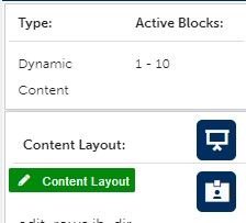
Application Info Block Editors

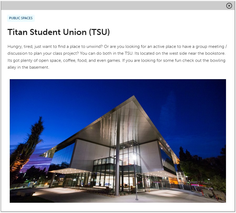
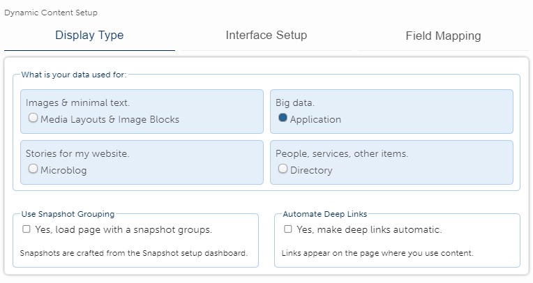
Adding content to your application item is now ready.  The default display for an application is to just show the content block section.  Other items are available but hidden until you need them.

stanard editor for applicaitons with hidden fields not displaying

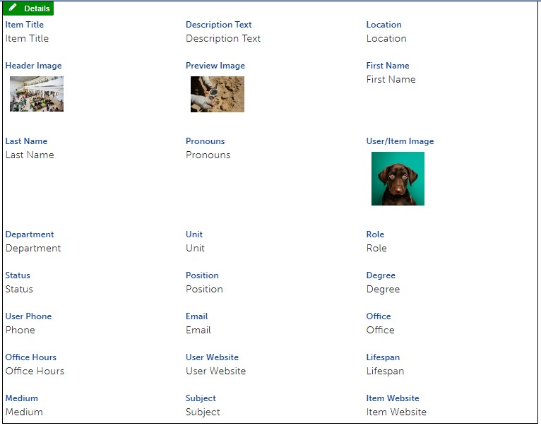
The info block record has a button on the far left side that will open fields for CSS, Categories, Tags, and Details.  If you choose to use the interface setup option to always show fields this box is hidden and all fields would show for all records.

Full view of all fields ready for editing info block applications


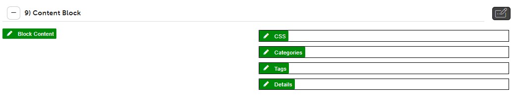
By default the content block number will not have a title.  As soon as one is used in the block content the value will update from 9) content block to 9) (your title value).

right col
 
 
left col

The Content Block

The content is the big single space for editors to write what they want.  In the application info block this is the main thing users will read.  You can edit using a standard CMS edit toolbar and craft the content as you need.

When users first load the info block the titles will display in small boxes taking up less space on the page.  By clicking on the title it will open to display the full contents of the info block record.

In the open example the "Public Spaces" is coming from the collection name, but everything else is from the content block.  Use images, headers, accordions, tab content, or anything else that you need to organize your ideas.

Review some of the application styles pages for inspriation on design and layout.


Default Results

example of three items returned in a three column row, titles are in separate boxes

Clicking on the last item opens the information

example of application content block data

right col
 
 
left col

CSS / Categories / Tags

The CSS editor allows you to style the item independantly.  It allows for options like accordion, tab content, and bucket content.  These will give several ways to orgnaize large data within the block content.

Categories and tags are universal for all info block types.  They provide comma separated items that will give end users tools to sort data.

Editor showing the CSS, Categories, and Tags sections

right col
 
 
left col

The Details Editor

Applications do not rely so much on using detail fields for end users to see, but if you want to sort the data based on specific fields (last name / first name) you will need to add it to the Details section.

While in the editor you can use the style dropdown menu to choose the field you want to give a value for.  Select the field and type your value.  The field name will automatically appear above the data that is typed.

If you press return within the editor it will retain the last used style.  You can use the style dropdown and look for check marks next to any used styles.  Verify that the correct style(s) have been used and uncheck the ones that no longer apply. Each time you uncheck the style menu will close and you need to reopen it - this is an Campus CMS behavior.

To make it easier on yourself after you have your first detail section completed and saved, we recommend to copy that field for the next one.  Each field will already have its style set and you can just change the data.


directory details options with all fields and data displayed

right col
 
 
left col

Detail Styles (Field Names)

Applications do not need every field, but to make sure you are aware of them here's a full list of all the style choices in the Details editor.  The styles are broken down into three sections: Item Info, User Info, and Content Info.  This was to help provide some context, but if you are working on a directory or resource centers, you can always treat each center as a user. 

Additionally this is where it is important to know if field mapping has been used.  There is no way to know from the drop-down styles if this particular directory is replacing the field name, check with content editors for clarification.

Item Info
  • Active (Y/N) - this allows us to hide items without deleting them
  • Item Title - provide context as to what is the item name
  • Description Text - depending on the interface this may show up in the default display or show on the larger full item view
  • Location - where the item is found, office building, relevant place
  • Header Image - an image which will either show up in the full view, or across the top of the info block.  Style will have a direct impact on where / when this displays
  • Preview image - mostly used for blogs, this will show up in full view on some interfaces alongside the description text
  • Sort Rank - usually a value like a number or letter, this is used for sorting based on editor choice and not something like a name.  Useful if you have a specific order that needs to be maintained - also be aware this values is manually updated
  • Set Published Date - the info block will track the original published date of each item.  If old content needs to be backdated or changed this will allow editors to overwrite with a new date
User Info
  • First Name - first name of user or item, this is important if you want to sort last name first, first name last
  • Last Name - last name of user or item
  • Pronouns - provides space to indicate user chosen pronouns (he/she/they) 
  • User/Item Image - image that is used by default for directory items
  • Department - most relevant department name
  • Unit - if user/item is within a department in a section or other area that is important
  • Role - could be speicifc duty, or function that is important to this item
  • Status - provides current information about item
  • Position - user hired as, or item placement / usage 
  • Degree - on a directory this will be placed after user firstname lastname with a comma
  • Phone - phone number where they can be contacted
  • Email - email address as text, or as a mailto link
  • Office - office number, building, etc
  • Hours - plain text version of office hours
  • User Website - plain text url, or hyperlink to website *do not use URL as hyperlink text
  • Lifespan - meant to be used for image galleries when looking at artist information, multiple entries may be allowed based on display style
Content Info
  • Medium - in art exhibits used to describe materials, multiple entries may be allowed based on display style
  • Subject - item subject matter, multiple entries may be allowed based on display style
  • Item Website - plain text url, or hyperlink to website *do not use URL as hyperlink text


detail styles dropdown menu showing an example of the list of styles

second half of the details style dropdown values

right col
 
left col
right col